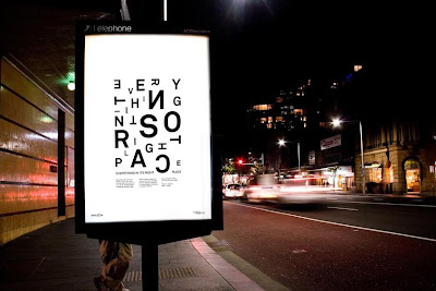

Designer: Felix Lobelius
This is a piece of work by a young designer working in Australia. He designed an awareness campaign for dyslexia, which he goes on to describe as 'a condition with lacking public attention'. Definitely a just statement, as most people are unaware of the many different levels of dyslexia, as its not simply people who can't read or write correctly. In fact the dyslexia can be substantially compensated for with proper therapy, training and equipment. And i think it is a very positive thing that establishments like universities, schools and even some work places offer the help and equipment needed to progress and function more easily.
Anyway back to the design... The poster design is an invitation to solve the riddle, 'Everything in its right place', its requirement for the viewer to get involved is quite obvious. The message conveyed is also extremely clear, the fact that you can't immediately read the copy is the intended message. You are placed quite convincingly into the shoes of someone who has dyslexia, which is extremely emotive and forces the audience to have some level of sympathy. The large out of place 'O' is the invading culprit, and because of its size and being near the central line of the design it is very hard to ignore. Along side the back to front letters, changes in orientations, angles and variations in size, they all add up to that overall feeling of empathy and understanding. The ironic campaign title is a fitting message, that finally drives home the message and gets the audience thinking about dyslexia.
If you fancy having a look at some of his other work then here is the link www.felixlobelius.com/

